The diabetes prevention CSC is a national public platform supporting over 1,400 health organizations and 780,000 participants with diabetes prevention resources and technical assistance.

Federal Health Agency’s Customer Service Center Website Redesign
MY ROLE
UX Co-Lead
User Research
Wireframes Design
Prototyping
Checkpoint Presentation
User Research
Wireframes Design
Prototyping
Checkpoint Presentation
TEAM
SCADpro Team:
8 UX Researchers
8 UX Designers
3 Illustrators
Deloitte Team:
2 Project Manager
2 Engineers
2 Team Members
8 UX Researchers
8 UX Designers
3 Illustrators
Deloitte Team:
2 Project Manager
2 Engineers
2 Team Members
TIMELINE
Jan - Mar 2025
TOOL
Figma
Adobe Photoshop
Adobe Illustrator
Adobe Photoshop
Adobe Illustrator

Overview
A little back story...

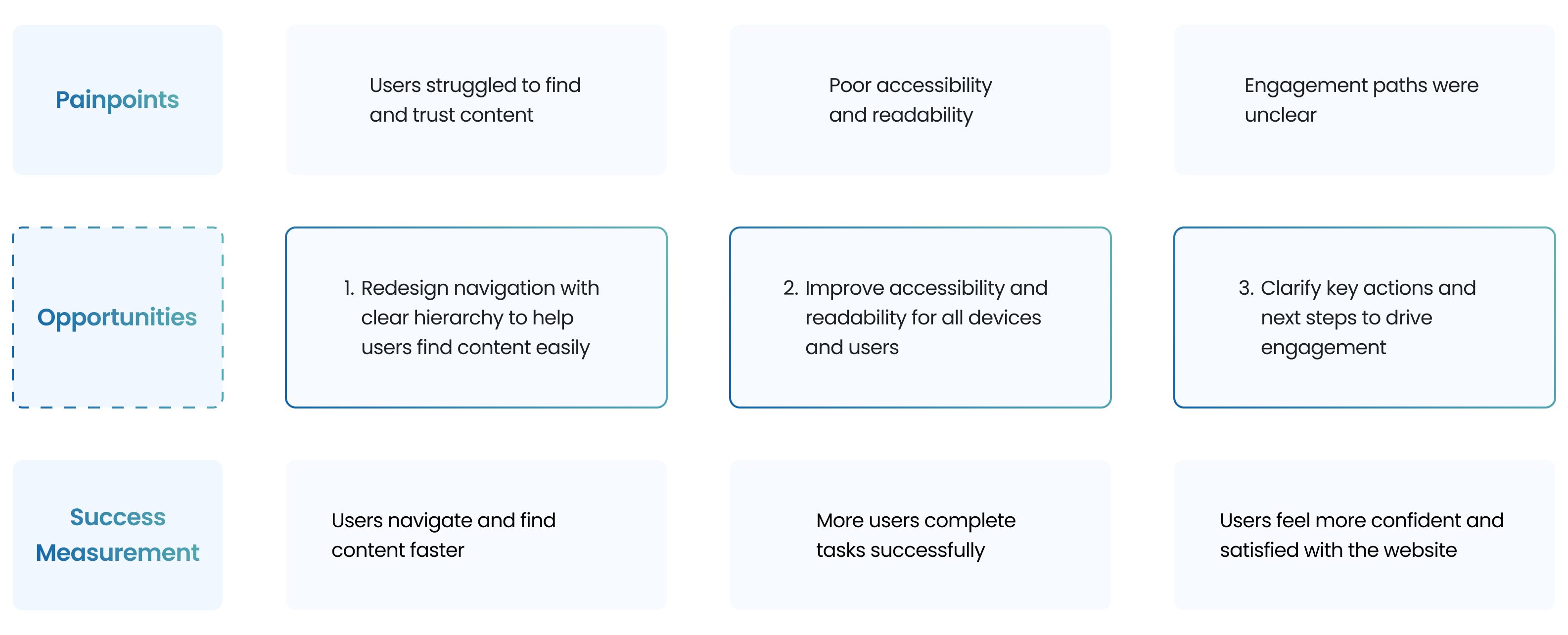
Problem
Many users struggle to navigate the CSC site and access the right resources, like toolkits, videos, and training materials.

My Role
As the UX Co-lead of a 21 person team, I partnered with PMs and developers on research, wireframes, and prototypes.
We designed within the constraints of Salesforce Experience Cloud, Customer Service template, 508 compliance, and limited end user access.
We designed within the constraints of Salesforce Experience Cloud, Customer Service template, 508 compliance, and limited end user access.
Design Challenge

Our Solution
What we’ve covered...
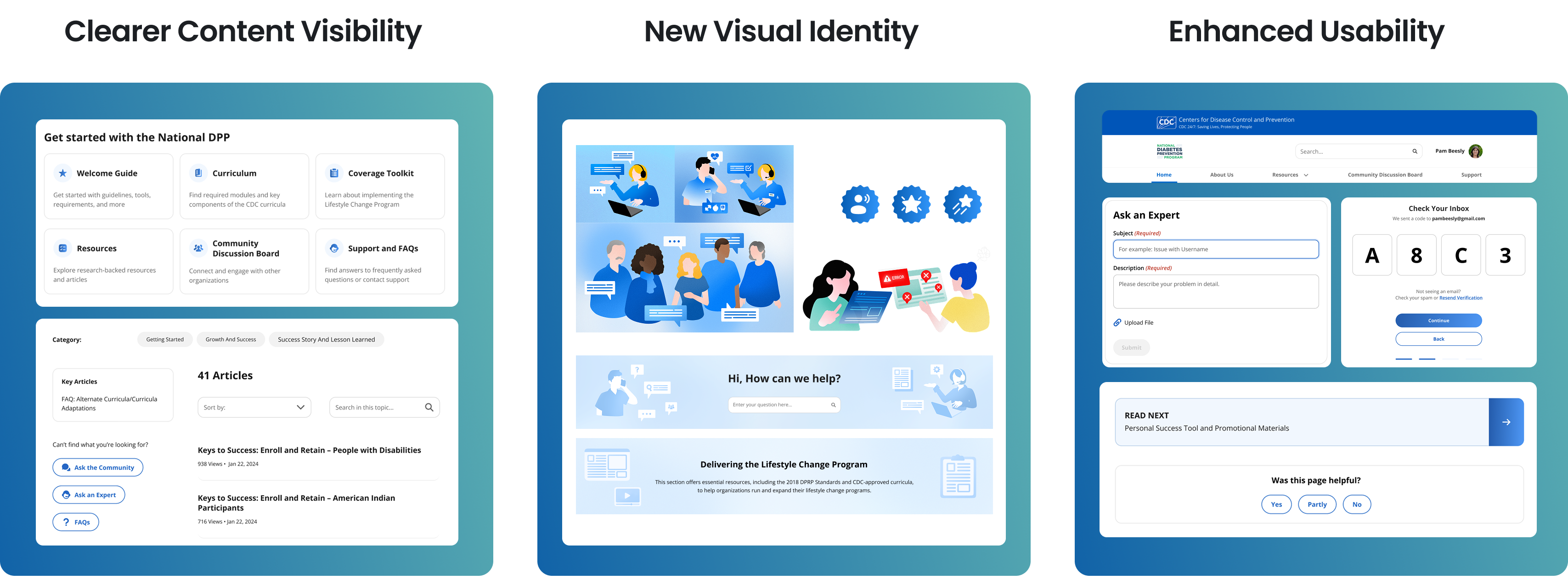
Navigating with ease – a smarter first impression
Challenge
The original homepage was cluttered with text and repetitive icons, lacking visual hierarchy and clear CTA, which confused users and made key resources hard to find.
Solution
We've revamped the homepage to be more modern, clean, and visually compelling. But most importantly, we've made it easier and quick for organizations to navigate through the site and find the information they need.

Improved structure – easier access to essential resources
Challenge
An overly long navigation menu, repetitive categories, and lack of visual separation made it hard for users to find relevant resources and understand content structure.
Solution
We reorganized the layout and refined the interface to improve discoverability, helping users locate the right information faster and with less friction.

Modern discussion board - Organized discussions & Better connection
Challenge
Users struggled to find relevant information. Posts visually blended together due to a lack of clear structure. The overall layout caused visual overwhelm, making it hard to focus on individual conversations.
Solution
We redesigned the board to be more modern, friendly, and approachable. Made it easier for organization to scan, engage with, and contribute to meaningful conversations.

Website Analytics
We started by listening to the numbers and learning from others
To understand where the current website was falling short, we first generated a analytics report:
⬇77.79%
Number of U.S. visitors to the CSC website
⬇16.78%
Desktop Monthly Visit
At the same time, we looked outward, analyzing 3 competitor websites in the public health space. We studied what they were doing well in terms of structure, clarity, tone and what gaps we could learn from to make this site stand out.


First Round Testing
Then, we turned to the stakeholders
Through initial testing with 20 stakeholders initially, we identified where users were getting lost, frustrated, or confused by the existing experience.
75% of users struggled using the current site


User Quotes


Sensory Cue
Setting the tone: Desining for trust and security
We noticed the current site used 7 different shades of green. To better understand how users emotionally responded to these colors, we ran a sensory cue survey to guide our future palette decisions.

80%
Linked blue to trust and security
73%
Preferred the blue option overall
Design Decision
From research to focus
After our initial research, the main problems becomes obvious. These findings became the foundation for our design focus—improving clarity, trust, and engagement across the experience.
Hey! If you are still here,
let's talk about how we get to the final design.
Ideation
We improved the information architecture.
We simplified the navigation through four key changes, making the navigation easier for users to find the information they need efficiently.


Testing & Iteration
We had ideas. Now it was time to test if they truly worked for real users.

After the mid-fidelity phase, we ran A/B testing with 22 participants on a tight schedule to evaluate key functionalities and visuals. We focused on how well users could navigate the site, complete tasks, and interact with the interface. We also tested color schemes and components to ensure accessibility and match user preferences.
Key insights from the usability tests and iterated designs included the following:
Key insights from the usability tests and iterated designs included the following:
1. Homepage before and after

2. Resources page before and after

3. Support - Ask for help page before and after

4. Support - My request page before and after

5. Profile - My activity page before and after


Now the moment you've all been waiting for…
Introducing a brand new CSC experience
Easy onboarding – confidence starts here
Challenge
Usability testing revealed that the page felt outdated and disconnected, with users frustrated by having to manually type and track confusing organization names.
Solution
We streamlined and clarified the sign-up flow, making it quicker, more approachable, and visually aligned with modern UX standards, enhancing user confidence.

A clear path to the website mission
Challenge
Cluttered content and weak visual hierarchy made it hard for users to find key info or take action, with no strong CTAs to support onboarding.
Solution
Improved visual structure highlights the National DPP’s mission and key resources, with a clear CTA, a newsletter sign-up awaits, inviting continued engagement.

Unified support hub – Instant answers & seamless help
Challenge
The original interface exhibited fragmented user flows between FAQ and Contact functions, compounded by redundant entry points and insufficient information scent.
Solution
Redesigned “FAQ” and “Contact Us” sections into a unified Support page with visual FAQs and clear category segmentation, streamlining navigation and reducing cognitive load.

Impact

Collaboration
Cross-functional collaboration
We explored ideas like gamification and custom UI elements early on, but after two working sessions with Salesforce developers, we gained a clearer understanding of the platform’s limitations. While some visual changes were possible, key layout components were harder to alter without affecting long-term stability. These conversations helped us ground our designs in what's technically feasible.
Throughout the project, we also held weekly checkpoints with PM, designers, and Deloitte stakeholders. Their input on everything from feature feasibility to data sourcing, challenged us to stay grounded, validate our ideas, and ensure each decision was practical for both users and the business.
Throughout the project, we also held weekly checkpoints with PM, designers, and Deloitte stakeholders. Their input on everything from feature feasibility to data sourcing, challenged us to stay grounded, validate our ideas, and ensure each decision was practical for both users and the business.

Behind the scenes
Finally, shout out to my amazing team!


Reflection
Takeaways
Back every design decision with research
Our shift in brand color direction was initially based on secondary research. While this gave us a foundation, it wasn’t enough to reflect how users emotionally respond to color. Running a sensory cue test later validated (and sometimes challenged) our assumptions. I learned that even visual or branding choices should be grounded in direct user insight when possible.
Sync with developers earlier
Connecting with the development team in week 4–5 gave us helpful clarity, but had we engaged earlier, we would’ve had more time to refine assets and align features with technical feasibility.
Next Project

